i mentioned in the Culture Collective post that i was up in Glasgow for an event last year (From Participation to Co-creation, run by Arts Homeless International in partnership with Creative Scotland and the Calouste Gulbenkian Foundation). i was there to introduce some ideas around data gathering and visualisation as they relate to vulnerability. i have been deeply drawn to data ethics since i first became a geek in the mid 90s – mostly because ‘data’ and ‘ethics’ are about as oxymoronic as they possibly could be. we do, after all, live in a capitalist world obsessed only by profits at the expense of the humans their systems allegedly service.
i haven’t written publicly about these ideas before because they’ve taken various shapes over the years (as indeed have i), and i wanted to let them (and myself) have the space and time to find their own flow. it’s nervewracking enough to explore new avenues in your professional practice without doing what i typically do, and announcing them too soon. however, i want to start being able to point to where these strands come from… so, it’s time to be brave and get them out there.
to kick things off, this is a rough transcript of my session. I recorded it for my own records (given i’d never publicly talked about it before and wasn’t entirely sure how it was going to come out!), but it’s not the best quality for sharing. this section was part of a participatory workshop around best practice in evaluation, lead by Katie Bruce, Monitoring & Evaluation Manager of Streetwise Opera. as such, it centres around how we gather vulnerable people’s responses when engaging in cultural projects, and how we map data about vulnerable people in the most respectful, inclusive, and meaningful ways possible (in this case homeless people, but the same rules apply broadly).
– o –
Hi, I’m fee, and I freelance with With One Voice [now Arts Homeless International] and the homelessness communities of Greater Manchester.
I am a geek. And I’m also neurodivergent. I’ve found the two tend to correlate.
I’m therefore the kind of person who actually enjoys looking at databases and spreadsheets, as strange as that might sound to most people. I’m not big into numbers so much, but I really enjoy exploring the patterns in data, and I like extrapolating the stories that can be found, woven through those patterns. Now, I know that staring at grids of numbers is not everyone’s idea of a good time, which is why it’s really important that we explore different ways of analysing and sharing that data (visualisation) in as much detail as the ways in which we gather it in the first place (data capture).
I was homeless myself for almost two years. One of the things that I repeatedly struggled with was how often you feel oppressed when you’re being questioned about your situation. In order to have any chance at all of receiving any support for your situation you have to justify why you became homeless and what’s broken about you or your life. You end up repeatedly tearing open all these deep wounds to comply with these strangers’ demands, with no one there to support you to put yourself back together again afterwards. To add insult to injury, this is almost always an unnecessary and meaningless procedure – the majority of the time, those gathering your information do absolutely nothing to help change your situation, or that of others like you.
I think there’s a vital and urgent importance to us changing how we do things, here. It is entirely possible to both gather relevant data while also being respectful of the people that we are asking this information from. I believe a really good way around that process is to centre playfulness and creativity about both what we’re gathering, and how we’re gathering it. In order for this to have meaning, we then have to make this data accessible to those who need to hear and understand it. And then we have to hold the people we share it with to account, so that it brings the changes we need to see in the world. We need to amplify voice and agitate ears, respectfully.
So… let’s do a really quick exercise to play with this idea a little. You are all sitting around tables in this room. Stay as you are, all I want to start with is a simple show of hands.
Put your hand up if you enjoy filling in surveys.
[a ripple of awkward laughter spreads around the room]
One ‘not decided’ over there… I’m getting maybe six, at a push. Okay, well that’s a pretty clear general consensus: we don’t like filling them in. Which to me begs the question: how do we expect other people to respond to our surveys, when we don’t even like filling them in ourselves?
Right, second question. And now this time I want to generate a sense of privacy in the space, so I’m going to ask you all to close your eyes. I want you to feel like this is a very safe and private space, so I’m going to trust you all that you’re going to keep your eyes closed through this question… otherwise it’s going to take too long for me to put a big blindfold on you all. Although… that could be fun. Maybe we should try that for another session.
Okay, so everybody: close your eyes.
Hands up if you have ever learned something unexpected from a project that didn’t quite go the way you were expecting it to. Let’s not call it ‘failure’, because failure is just learning what we haven’t fully absorbed as a new norm, yet.
Great, now keep your eyes closed [counts hands]. Excellent, you can put your hands down, and then open your eyes. Hahaha, none of you know what the answer is. I’m the only one who knows! And I’m not telling you!
Right, and a third one: I’d like you all to stand up. Now I normally do this in a line across the space but I think that’s going to be a bit too difficult in this context. I want you to treat the front of the table (so the side of the table that’s closest to me) as the position which means ‘Yes’, and the back of your table means ‘No’. The sides are the gradients between, so we’re looking at a spectrum of response, rather than just a binary yes or no response.
This time your question is “Can the Arts save the world?”
If you believe yes, the arts can save the world then come closer to me on your table – or you can come all the way to the front of the room if you really want to.
And if you do not believe that the arts can save the world, move to the back of your table.
[much movement, chatter and background noise as people negotiate their positions]
Okay! Interesting… lots of people on the sides. I thought given the context of this event it’d be more binary.
Right, so, random selection…. the lady in the back with the amazing locks. Can I please ask you why you are standing where you are standing?
“I’m confused about where’s the front or back of a round table” [laughter]
Ahh, OK, then that is what we would call ‘a badly formatted research methodology’, um, sorry about that! [more laughter]
Now, somebody who’s at the back of the table… the gentleman there. Can you tell us why you decided to stand there?
“I’m waiting for further evidence”
Ahh, yeah, I can see that. I’m sensing ‘hope’ here as well, but maybe that’s just me.
And the lady standing on the side of her table, there.
“I think there’s a lot of change which can happen through the arts, but we have to do a lot to change ourselves too, individually and in the arts. And we’re not there yet”.
So: it’s possible, but we need to do the work. Yeah. We always need to do the work.
“There’s also something about who’s world’s we’re changing – art changing other people’s worlds, or art changing our own world.”
See, now you’re just changing the entire premise of the research question! [laughter]
Great, thank you very much. You can all sit down again now.
Okay, so that was a really, really rapid snapshot of basic approaches to the data that you’re gathering. You’ve got the binary “Do you like __? Yes/No”. You’ve got the public/private side of “How have you personally experienced a thing?” And then more of a spectrum of responses from the third question.
So you can get a finite number; you can get a sense of individuals; and you can get the grey areas that open to a further dialogue about these things.
There are just so many different ways that you can make gathering data far more interesting, for everyone. Being a neurodivergent nerd, I’ve recently become very enamoured with bullet journals (also… stationery addiction much?! oh yes please!) So there’s this massive thing at the moment about bullet journals and wellbeing trackers. I mean, there’s a whole ‘Instagram influencers’ movement around “here’s my absolutely exquisitely illustrated bullet journal”, which is so much more about their artistic skills than it is about the way that the bullet journal itself is changing their way of doing things. But it doesn’t matter if it inspires us. Even sketching out a grid on a piece of paper to map how much water we’re drinking each day, or how many days a week we hit our 10,000steps can help to make our lives just a tiny bit better. The act of tracking adds extra weight to the action of that behaviour, and the end result shows us where we might want to focus the next week, or how far we’ve progressed over time.
I think things like how, and where, and when we’re gathering what kind of data is also really important. As Katie was saying, you can do the evaluatory survey asking “How do you feel at the beginning of the project? / How do you feel at the end of the project?”, or you can give people a drawing of a tree. All the leaves on the tree represent the number of days they’re involved in the project. And there can be a colour chart, so they can colour a leaf in brown if they’re feeling a bit rubbish, and they can colour it yellow if they’re feeling really happy. Or they can have a bit of brown with a bit of yellow and a bit of green, they can make it their own. And their simple and personal engagement in a creative scribble is giving you some information about both their progress and how they feel about their progress. All in a totally non-oppressive, playful, creative way.
You can use a myriad of applications for datavisualisation, too. There are so many different tools and platforms where you can upload spreadsheets of data, and they will interpret them into a billion different pretty graphs. Do you want bubble sets? Do you want geographic locational maps? Or do you want to represent durational shifts over time in sculptural form? In Denmark they’re so progressive about water conservation that they have public artworks which actually show how much water has been saved that month. So you’ve got this massive public space environment which visually says “actually, we’re not doing well enough as a community at the moment: we’ve been using too much water”. And then that starts a public conversation without anybody having to go “You know what? I think we need to talk about our use of water”. It’s just there, right in the heart of town.
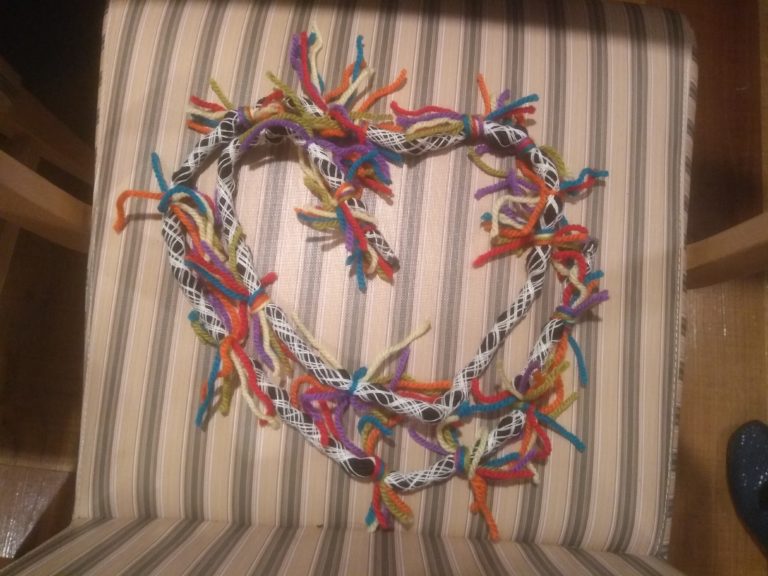
Now, given the worldwide homelessness crisis, more and more countries are doing ‘street counts’, mapping how many homeless people are on a street on a given night, usually once or twice a year. I’ve been involved in street counts in Manchester and they’re quite something. We were over in Japan recently, and the Japanese government does a street count, but during the day. Not the most accurate way to do things, which is hard to see as anything other than an intentional denial of the severity of the issue. We went over to work with a community in Tokyo called ARCH (the Advocacy and Research Centre for Homelessness) and they took us out on their street count on our last night there. Before that night I’d been having conversations with Nao, the woman who founded ARCH, about what we could do creatively with the data that they’re gathering. I suggested a few things, and when the night came around she turned up with these beautifully drawn instructions and long twines of rope and yarn; my little data visualisation suggestions had become so real for her that they’re now just what they do to end the counts. So we had these big long pieces of black rope twined with white string, the length dictated by each location’s length of walk. Then each of us doing the data gathering had a particular colour of yarn. And we cut the yarn up to represent the number of people that we found homeless, sleeping out on the streets that night.
We did the count in small groups, on foot, with maps and pencils to sketch out what we saw. Gathering back as a big group in the early hours of the next morning, we double checked our maps against each other to confirm we hadn’t double-counted, used their coded systems for logging specific criteria, and arrived at the final night’s count. Then we each put our pieces of rope and yarn together to represent those numbers. Some of the street counters would tie their yarn along the rope to show where on the walk they saw the rough sleepers – it was at the beginning of the walk, it was in the middle of the walk, or at the end of the walk. Others tied a cluster of everything right in the middle of the rope to emphasise the quantities more vividly. We ended up with these really beautiful, tactile representations of the data we’d collectively gathered – something painful and disturbing that we prefer to hide from, made beautiful, meaningful, undeniably present and which included our own identities and our commitment to change. One idea I’d had in those early conversations was that if we were to use beads to represent the homeless people, then we’d end up with something physically heavy too: a literal weight to carry instead of an abstract digit on a spreadsheet. You’re now exploring a physical manifestation of the emotional message that we can share about the data that we’re gathering. How you can affect the way people physically and emotionally feel when they engage with the statistics that you’re sharing about vulnerable human’s lives.
Unfortunately we live in an era of fake news, of manipulated and obfuscated statistics, of a disgusting lack of truth. So you could argue that we don’t need data because nobody would believe it anyway. But we believe it, and we know it’s important. And we know that the vulnerable people that we work with will trust us if we listen to them. Especially if we can show them that we’re learning how to do better, and doing something meaningful with what they’re telling us.
So yeah, gather your data, play with all this, make it work for you. But, exactly as Katie said earlier: work with your community around it all. Let them tell you how they would like their data to be tracked. If they want it to be tracked at all.
Thank you.
[image title: possibly the world’s first data-visualised homelessness street count, Tokyo, Aug 2019.
image credit: (c) @feesable BY-NC
image description: a photograph of tactile datavisualisation from a homelessness street count in Japan in August 2019. the photo shows the seat of a chair with yellow, green and white striped fabric. on the seat sits a long twine of black rope wrapped in white string, with coloured yarn tied along it. the rope is curved into the shape of a heart. the black rope represents the length of the area walked and mapped during that night. there are many knots of shorter, coloured yarn tied along the rope. the colours (orange, yellow, blue, green, cream and red) represent each of the people undertaking the street count that night. the number of knots represents the number of homeless people we counted that night. the position of each knot on the rope represents where along the walk we saw the people sleeping on the streets.]